Query Performance Data
Glossary terms: Benchmark, Application, Experiment, System, Modifier
Query the average time for the main region in the completed HPL workspace:
$ benchpark query workspace/fluxtainer/hpl/workspace \
    --metric "Avg time/rank" \
    --query-regions-byname main
The original plotting example uses Matplotlib to create a stacked bar chart from the queried data:
import pandas as pd
import matplotlib.pyplot as plt

df_comp = pd.read_csv("computation-time.csv")
df_comm = pd.read_csv("communication-time.csv")

value_col = "Avg time/rank (exc)"
version_col = "packages.dependencies.hip.version"
group_cols = ["cluster", "application_name", version_col]

bar_df = (
    pd.concat(
        [
            df_comp.assign(region="Computation"),
            df_comm.assign(region="Communication"),
        ],
        ignore_index=True,
    )
    .groupby(group_cols + ["region"])[value_col]
    .mean()
    .unstack(fill_value=0)
    .reset_index()
)
bar_df["total"] = bar_df["Computation"] + bar_df["Communication"]

amg_df = bar_df[bar_df["application_name"] == "amg2023"].set_index(
    ["cluster", version_col]
)

ax = amg_df[["Computation", "Communication"]].plot.bar(stacked=True)
ax.set_xlabel("System and ROCm version")
ax.set_ylabel("Average time per rank (seconds)")
plt.tight_layout()
plt.show()
Note
The following figure contains extra styling that is not provided in the simplified code snippet above.
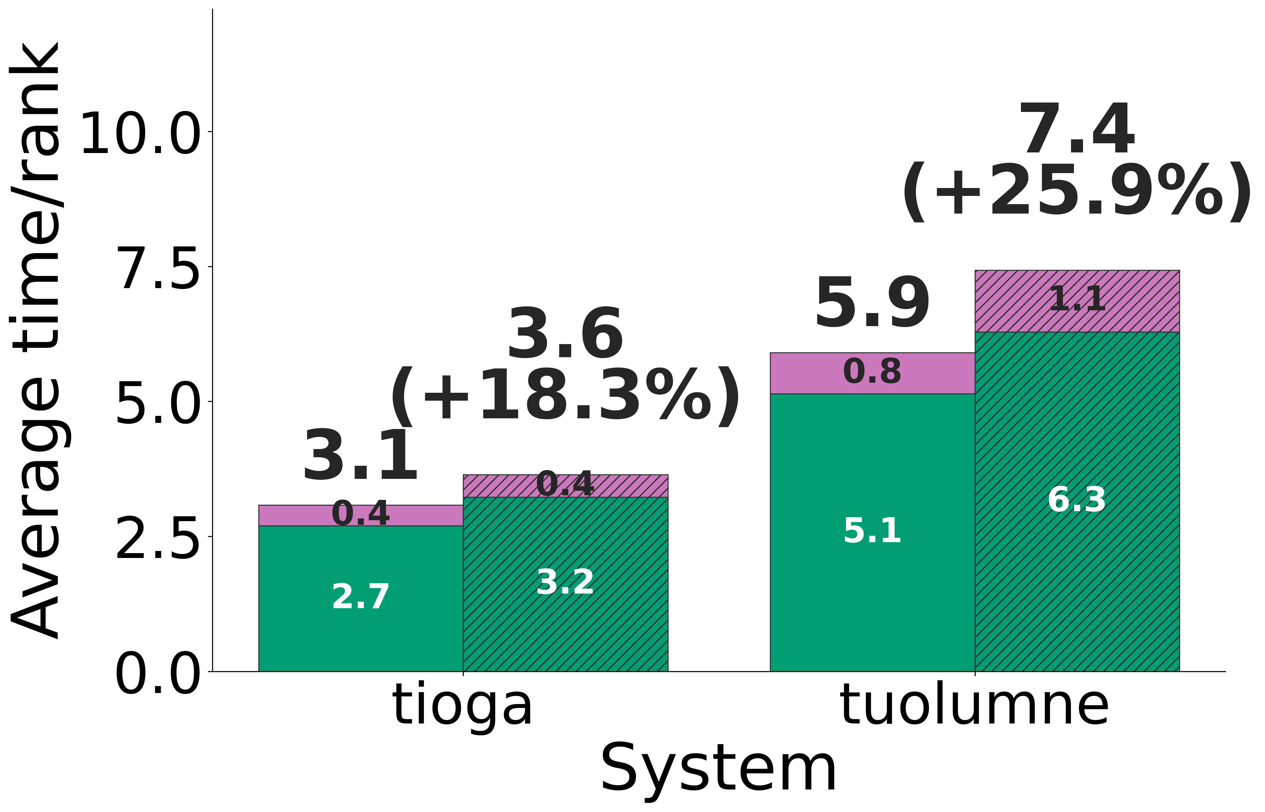
Example visualization created from queried performance data.
For additional metrics, region selection, and CSV options, see Query Performance Data.