Analyze a Scaling Study
Glossary terms: Benchmark, Experiment, System, Modifier, Scaling Study
Install the analysis dependencies once from the Benchpark repository:
$ pip install .[analyze]
Analyze the completed HPL scaling study from Build and Run an Experiment:
Strong Scaling
The default stacked area chart shows the exclusive average time per rank for each instrumented region. The x-axis records the node and MPI-rank counts varied in the strong-scaling study.
$ benchpark analyze --workspace-dir workspace/aws-tutorial/hpl/workspace
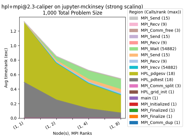
Strong-scaling area chart.
Percentage
The percentage chart expresses each region’s metric relative to the sum for all regions. This makes each region’s share of total time easier to compare.
$ benchpark analyze --workspace-dir workspace/aws-tutorial/hpl/workspace --chart-type percentage
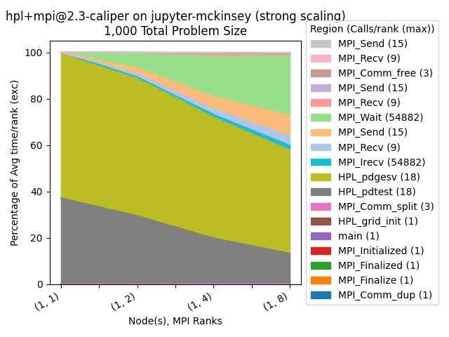
Strong-scaling data shown as a percentage of total time.
Inclusive Metrics
The inclusive chart uses Avg time/rank instead of Avg time/rank (exc).
$ benchpark analyze --workspace-dir workspace/aws-tutorial/hpl/workspace --yaxis-metric "Avg time/rank"
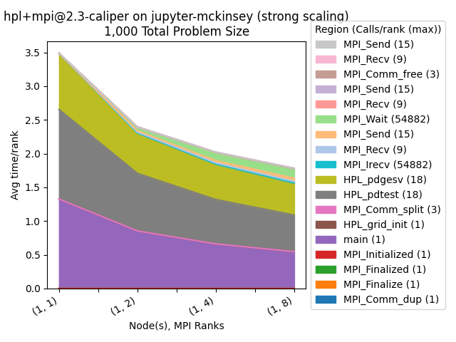
Strong-scaling data using an inclusive metric.
Region Filtering
This figure combines regions that have the same name, then retains the regions with the highest metric values. The filtered view emphasizes the regions that contribute most to the measured time.
$ benchpark analyze --workspace-dir workspace/aws-tutorial/hpl/workspace --group-regions-name --top-n-regions 10
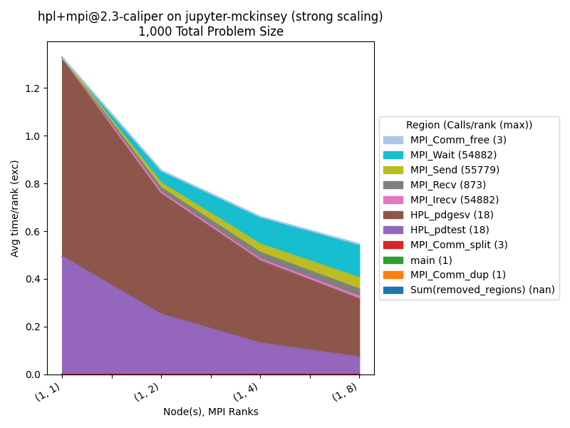
Strong-scaling data after filtering regions.
For additional chart types and filtering options, see Analyze a Scaling Study.