Visualizations API
TreeScape provides two visualization classes: StackedLine for interactive Jupyter visualizations and MultiLine for static matplotlib plots.
StackedLine
- class StackedLine
Interactive visualization with line graphs and flame graphs for Jupyter notebooks.
Displays performance data over an X-axis (time, problem size,, etc.) with:
Line graphs: Show performance trends
Flame graphs: Show call tree hierarchy at selected points
Interactive drill-down: Click to explore deeper into the call tree
import treescape as ts

reader = ts.CaliReader("/path/to/data")
model = ts.TreeScapeModel(reader)

viz = ts.StackedLine()
viz.setXAxis("launchdate")
viz.setYAxis("avg")
viz.setDrillLevel(["main", "compute"])
viz.render(model)
Constants:
- SUM = "sum"
Aggregation mode: sum all values.
- AVG = "avg"
Aggregation mode: average all values.
- MAX = "max"
Aggregation mode: take maximum value.
- MIN = "min"
Aggregation mode: take minimum value.
- TOPMAX = "topmax"
Aggregation mode: special stacked visualization.
- LINEGRAPHS = "linegraph"
Component type: line graphs.
- FLAMEGRAPHS = "flamegraph"
Component type: flame graphs.
Configuration Methods:
- setXAxis(xaxis_name)
Set the X-axis metadata field.
- Parameters:
xaxis_name (str) – Name of metadata field (e.g., “launchdate”, “problem_size”)
viz = ts.StackedLine()
viz.setXAxis("launchdate")   # Time series
viz.setXAxis("problem_size") # Scaling study
viz.setXAxis("jobsize")      # MPI rank scaling
- setYAxis(yaxis_name)
Set the Y-axis metric to display.
- Parameters:
yaxis_name (str) – Metric name (“sum”, “avg”, “max”, or “min”)
- Raises:
ValueError – If yaxis_name is not valid
viz = ts.StackedLine()
viz.setYAxis("avg")  # Show average time
viz.setYAxis("max")  # Show maximum time
viz.setYAxis("sum")  # Show total time
- setXAggregation(aggregation)
Set how multiple values at the same X position are aggregated.
- Parameters:
aggregation (str) – Aggregation method (“sum”, “avg”, “max”, “min”, “topmax”)
- Raises:
ValueError – If aggregation is not valid
viz = ts.StackedLine()
viz.setXAggregation("sum")    # Add values together
viz.setXAggregation("avg")    # Average values
viz.setXAggregation("max")    # Take maximum
viz.setXAggregation("topmax") # Special stacked mode
- setDrillLevel(nameOfLinesToPlot)
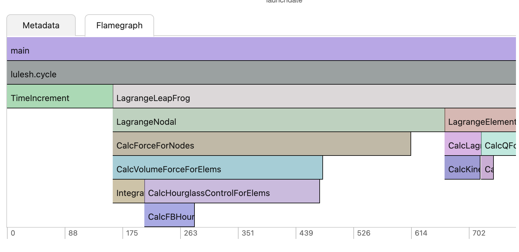
Set which functions to display as lines. Performance data is structured as a tree. Each layer of the tree is a drill level that allows you to jump one level down when you click on it.
viz = ts.StackedLine()
viz.setDrillLevel(["main"])  # Show only main
viz.setDrillLevel(["main", "compute", "io"])  # Show multiple
- setYMax(yMax)
Set the maximum value for the Y-axis.
- Parameters:
yMax (float) – Maximum Y value
viz = ts.StackedLine()
viz.setYMax(100.0)  # Cap at 100 seconds
- setYMin(yMin)
Set the minimum value for the Y-axis.
- Parameters:
yMin (float) – Minimum Y value
viz = ts.StackedLine()
viz.setYMin(0.0)  # Start at 0
- setWidth(width)
Set the chart width in pixels.
- Parameters:
width (int) – Width in pixels
viz = ts.StackedLine()
viz.setWidth(1600)  # Wide chart for presentations
- setHeight(height)
Set the chart height in pixels.
- Parameters:
height (int) – Height in pixels (default: 400)
viz = ts.StackedLine()
viz.setHeight(800)  # Tall chart for detail
- setComponents(components)
Set which components to display.
- Parameters:
- Raises:
ValueError – If components list contains invalid values
viz = ts.StackedLine()

# Show both
viz.setComponents([ts.StackedLine.LINEGRAPHS, ts.StackedLine.FLAMEGRAPHS])

# Show only line graphs
viz.setComponents([ts.StackedLine.LINEGRAPHS])

# Show only flame graphs
viz.setComponents([ts.StackedLine.FLAMEGRAPHS])
Rendering Methods:
- render(tsm_or_list, **kwargs)
Render the visualization in a Jupyter notebook.
- Parameters:
tsm_or_list (TreeScapeModel or list) – TreeScapeModel or list of data
kwargs – Additional rendering options
- Keyword Arguments:
xaxis – Override X-axis (str)
drill_level – Override drill level (list[str])
xaggregation – Override X aggregation (str)
components – Override components (list[str])
ymin – Override Y minimum (float)
ymax – Override Y maximum (float)
make_stub – Create stub data for testing (int, 0 or 1)
viz = ts.StackedLine()

# Simple render
viz.render(model)

# Render with overrides
viz.render(
    model,
    xaxis="problem_size",
    drill_level=["main", "compute"],
    ymin=0.0,
    ymax=100.0
)

# Render with stub data (for testing)
viz.render(model, make_stub=1)
- exportSVG(directory, all_tests, metavar, node_names, testname)
Export the visualization to SVG format.
- Parameters:
viz = ts.StackedLine()
viz.setYMax(100.0)
viz.setYMin(0.0)

viz.exportSVG(
    directory="/output/path",
    all_tests=model,
    metavar="launchdate",
    node_names=["main", "compute"],
    testname="performance_test"
)
MultiLine
- class MultiLine(all_tests)
Static matplotlib-based multi-line plotting for publication-quality figures.
- Parameters:
all_tests (TreeScapeModel or list[Run]) – TreeScapeModel or list of Run objects
import treescape as ts

reader = ts.CaliReader("/path/to/data")
model = ts.TreeScapeModel(reader)

# Sort by date first
sorted_model = sorted(model, key=lambda x: x.metadata["launchdate"])

# Create plotter
ml = ts.MultiLine(sorted_model)
ml.plot_sums("launchdate", "main", "test")
Methods:
- plot_sums(xaxis, node_name, line_metadata_name)
Plot sum values for a node, with separate lines per metadata value.
- Parameters:
Creates a matplotlib figure showing performance over the X-axis, with separate lines for each unique value of
line_metadata_name.ml = ts.MultiLine(model) # Plot main function over time, separate line per test ml.plot_sums("launchdate", "main", "test") # Plot compute function over problem size, separate line per configuration ml.plot_sums("problem_size", "compute", "config") # Plot IO over job size, separate line per node count ml.plot_sums("jobsize", "io_operations", "node_count")
Date Formatting:
When xaxis is “launchdate” or “launchday”, the X-axis is automatically formatted with human-readable dates:
Long time spans (>3 years): Shows every 6 months (YYYY-Mon)
Medium spans (1-3 years): Shows every 2 months (YYYY-Mon)
Short spans (3-12 months): Shows every 2 weeks (Mon-DD)
Very short spans (<3 months): Shows every few days (Mon-DD)
Figure Customization:
The generated figure can be further customized using matplotlib:
import matplotlib.pyplot as plt
import treescape as ts

ml = ts.MultiLine(model)
ml.plot_sums("launchdate", "main", "test")

# Customize after plotting
plt.title("Custom Title")
plt.grid(True, alpha=0.3)
plt.savefig("output.png", dpi=300)
Examples
Basic Interactive Visualization
import treescape as ts

reader = ts.CaliReader("/path/to/data")
model = ts.TreeScapeModel(reader)

viz = ts.StackedLine()
viz.setXAxis("launchdate")
viz.setYAxis("avg")
viz.setDrillLevel(["main"])
viz.render(model)
Customized Interactive Chart
viz = ts.StackedLine()
viz.setXAxis("problem_size")
viz.setYAxis("max")
viz.setXAggregation("topmax")
viz.setYMin(0.0)
viz.setYMax(200.0)
viz.setWidth(1600)
viz.setHeight(800)
viz.setDrillLevel(["main", "compute", "io"])
viz.setComponents([ts.StackedLine.LINEGRAPHS, ts.StackedLine.FLAMEGRAPHS])
viz.render(model)
Comparison Visualization
import treescape as ts

reader = ts.CaliReader("/path/to/data")
model = ts.TreeScapeModel(reader)

# Compare baseline vs optimized
baseline = [r for r in model if r.metadata["version"] == "baseline"]
optimized = [r for r in model if r.metadata["version"] == "optimized"]

for runs, title in [(baseline, "Baseline"), (optimized, "Optimized")]:
    print(f"\n{title}:")
    viz = ts.StackedLine()
    viz.setXAxis("problem_size")
    viz.render(ts.TreeScapeModel(model.reader, runs))
Static Matplotlib Plot
import treescape as ts

reader = ts.CaliReader("/path/to/data")
model = ts.TreeScapeModel(reader)

# Sort by date
sorted_model = sorted(model, key=lambda x: x.metadata["launchdate"])

# Create plot
ml = ts.MultiLine(sorted_model)
ml.plot_sums("launchdate", "main", "test")
Multiple Nodes on Same Plot
import matplotlib.pyplot as plt
import treescape as ts

reader = ts.CaliReader("/path/to/data")
model = ts.TreeScapeModel(reader)

plt.figure(figsize=(12, 8))

# Plot multiple nodes
for i, node in enumerate(["main", "compute", "io"], 1):
    plt.subplot(3, 1, i)
    ml = ts.MultiLine(model)
    ml.plot_sums("launchdate", node, "test")
    plt.title(f"{node} Performance")

plt.tight_layout()
plt.savefig("multi_node_comparison.png", dpi=300)
Exporting to SVG
import treescape as ts

reader = ts.CaliReader("/path/to/data")
model = ts.TreeScapeModel(reader)

viz = ts.StackedLine()
viz.setXAxis("launchdate")
viz.setYAxis("avg")
viz.setYMin(0)
viz.setYMax(100)

viz.exportSVG(
    directory="/output/path",
    all_tests=model,
    metavar="launchdate",
    node_names=["main", "compute", "io"],
    testname="nightly_regression"
)
Performance Over Time
import treescape as ts

reader = ts.CaliReader("/nightly/tests")
model = ts.TreeScapeModel(reader)

# Sort by date
sorted_model = sorted(model, key=lambda x: x.metadata["launchdate"])

# Interactive view
viz = ts.StackedLine()
viz.setXAxis("launchdate")
viz.setYAxis("avg")
viz.setDrillLevel(["main"])
viz.render(ts.TreeScapeModel(model.reader, sorted_model))

# Static view for report
ml = ts.MultiLine(sorted_model)
ml.plot_sums("launchdate", "main", "branch")
Scaling Study
import treescape as ts

reader = ts.CaliReader("/scaling/study")
model = ts.TreeScapeModel(reader)

viz = ts.StackedLine()
viz.setXAxis("problem_size")
viz.setYAxis("avg")
viz.setXAggregation("avg")  # Average multiple runs
viz.setDrillLevel(["main", "computation", "communication"])
viz.render(model)
Best Practices
For Interactive Visualizations:
Sort data before rendering for better X-axis ordering
Use appropriate Y-axis limits to focus on relevant ranges
Select drill levels that represent key performance bottlenecks
Choose appropriate aggregation for your analysis
For Static Plots:
Always sort data by X-axis before plotting
Use descriptive metadata for line separation
Save high-DPI figures for publications (300+ DPI)
Customize after plotting for publication quality
Performance Tips:
Filter data before visualization to reduce rendering time
Use appropriate aggregation to reduce data points
For large datasets, consider sampling or binning
See Also
Models API - Understanding the data model
Readers API - Loading data for visualization
Examples - More visualization examples